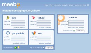
Today I launch the meebo website. Oh! It has a new look.

meebo new face
There is a few changes for the new meebo release.
New visual design. Is not much different for me, the old design is good enough.
Drag and drop buddy list management. Ya! This is good, it make the buddy list management much more easier, just drag and drop will do. If they can merge 2 (or more) account into one, like AdiumX do, that will will even better.
(Some user, like me, have more than one IM account, in AdiumX, you can merge the 2 account into a same id, dislay as one in the IM client)
Updated chat logs. It make the browsing for the historical chat logs much easier, but still can't beat if you can search it (like what Google Talk does).
There are something that I don't like:-
Pop outs. If I like pop outs, I would never use tab browsing... Ok, I did once like to open url link in new browser window, but now I get use to tab browsing. :)
Where is the backgroup like buddy icon? I like the semi-transparent buddy icon, which display like a backgroup image on upper right corner of the chat window. I like the semi-transparent buddy icon, even though is so blur that you could hardly seen it sometimes. They have changed to a solid image, the wording will wrap around and never overwrite the buddy icon picture. I hope they can keep that on Mac OS X platform, because OS X like to use semi-transparent graphics, it look nice.
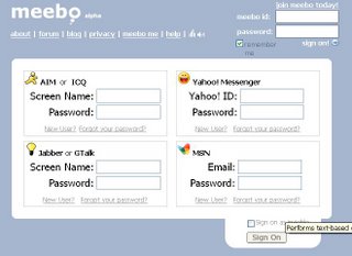
For those who prefer the old design, you can alwasy access to their classic skin.

You can always switch back to classic skin
I believe meebo will have more skins in the future.
PS. meebo is a web (ajax) base instant messenger, which use open source GAIM engine at the backend.
Monday, November 06, 2006
Meebo new face
Subscribe to:
Post Comments (Atom)
No comments:
Post a Comment